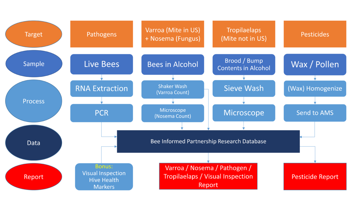
The National Honey Bee Disease Survey can be a difficult thing to wrap your head around. We hope this flowchart and guide can give a sense of how honey bee data comes together to create our reports. First, we will provide an explanation of how to read this flowchart, followed by a brief discussion of how all of the specific data make their way into the report.
Reading the Flowchart
The column of ovals on the left are labels for each row. Throughout the chart, each small blue arrow represents the data in some form as it makes its way from the colony to the report, whether it is a viral particle still inside the bee, or a Varroa mite attached to a bee, or the digital file that is finally used to generate each report in the end. Starting at the top row, for each colony we inspect, the targets of disease are molecular pathogens, Varroa mites and Nosema spores, Tropilaelaps mites, and pesticides. The second row from the top shows the four types of samples taken for the disease target listed above. Continuing down, the next two middle rows tell what processing we must use to generate the data (second row from-the-bottom) that we will upload into the database at research.beeinformed.org. When you look at this chart, you can see how all the information flows into the final report. You will have to forgive that we had to squeeze one extra process and data set of hive health markers from the apiary inspector’s visual inspection onto the bottom row. We generate a lot of data!
Following the Blue Arrows
Molecular Pathogens
For molecular pathogen detection, it is important that genetic material is preserved throughout transport, which is most easily achieved by shipping live bees. Upon receipt, live bees are frozen and processed to extract the genetic material RNA. The RNA is then screened via a process called PCR, which detects matches to known molecular pathogens’ genetic codes, such as those found in viruses and fungi. This video shows a simple overview of the steps in this process. Once we have detected any matches within a sample, we can upload the data into our database.
Varroa and Nosema
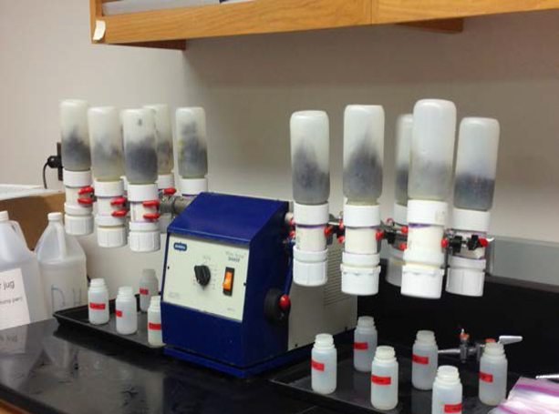
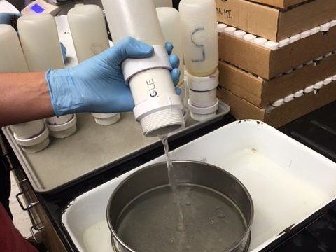
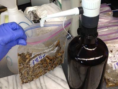
For Varroa mite counts, we collect samples of adult bees and ship them from hive to lab in bottles of alcohol. The bottles are attached to a mechanical shaker (figure 1), and after time, Varroa mites attached to these bees become dislodged and collect below a sieve (figure 2). These mites are easy to count with the naked eye, and the number counted for a given sample is then ready to upload into the database. The bees that were shaken can be further screened at this point for Nosema spores by crushing the bees in water and viewing the mixture under a microscope (figures 3 and 4). At a high magnification of 400x, Nosema spores can be counted and the data uploaded to the database.


Tropilaelaps
Tropilaelaps mites are not found in the United States, and if this invasive species ever did make an appearance, we would want to know ASAP. A hive’s brood frame is bumped to dislodge the contents of some cells, which is collected in alcohol and sent to the lab. These samples are washed through a sieve, and any small, mite-sized material is viewed under a microscope. Fortunately, all of the data collected and uploaded to the database has been negative for Tropilaelaps detection, and we hope it stays that way.
Pesticides
For a selection of colonies from each U.S. state, wax or pollen (type depends on year) may be collected and sent to the lab for pesticide screening. The sticky nature of wax means that to get a good mixture of material from all eight sampled frames, we must freeze the wax using liquid nitrogen and pulverize it until it forms a homogenized blend. Pollen homogenization can be more simply achieved at room temperature during processing. Samples are sent to the USDA AMS chemistry labs in North Carolina for pesticide residue screening. The detected pesticide molecules are recorded for each sample, and that data is uploaded to the database. Previous to the current survey year, pesticide data was the only data that would then appear as its own report.
Visual Inspection
The final bonus set of data comes from the inspectors in the form of the hive data sheet. During the inspection, markers of colony health are assessed visually by the inspector and recorded. Importantly, this data sheet also contains the basic information about the colony itself, without which we cannot generate and return a custom, specific report for each beekeeper! Making sure the beekeepers get their own individual reports is very important to everyone involved.

Wrap-Up
That should summarize the six blue arrows of data that make their way to the database on our flowchart. Previously, we had to wait until all the data (except pesticides) had been collected and uploaded before an individual beekeeper’s report could be generated. Starting with the 2020-2021 sampling period, we are now be able to generate partial reports as each target type is received and processed along its appropriate column in the flowchart. We look forward to getting information into beekeepers’ hands much more quickly.
Thanks to all the beekeepers who have patiently waited for their reports over the years; we hope it is now easier to see why the turn around was sometimes a bit longer than some would have liked!
