Estimated Reading time: <15 minutes
Introduction:
Scientists are known for spending endless hours at the microscope, making repeated measurements to capture as much data as possible. But in the end, researchers hope for an extraordinary result: a singular descriptive graph or an elegant formula that will summarize all of their hard work. A picture is worth a thousand words, and that certainly holds true for most graphs. So much can be read from these seemingly simple methods of communication, but they can also annoy and aggravate if the graphs are not intuitive or if the numbers provide no context. If you remember nothing else from this blog, remember that a number alone means nothing; context is everything!
[As an aside, for those who are interested in context, a famous image is the Ebbinhaus illusion, shown below. Due to the size of the circles around it (context!) the orange circle on the left appears smaller than the orange circle on the right, when, in fact, they are the same size.] So let’s see what context we bring to your APHIS National Survey reports.

In this blog, we will demystify your results by walking through an APHIS survey report. Visual communication is part art and part science. If you have been a participant for the past 10 years, you will have seen quite a visualization revolution in these reports. Every year, we try to make improvements and clarifications, but that is a blog for another time. Let’s start with what we have now.
Your APHIS survey report is broken down into 5 parts: 1) Cover Letter, 2) Colony Visual Field Inspections, 3) Lab Diagnostics, 4) Molecular Pathogen Diagnostics, and 5) Pesticide Results (if applicable).
Cover Letter:
This letter previews what will be covered in your report. Because some diagnostics take longer than others, such as Molecular and Pesticide, we have created a report template that allows for partial reporting. By sending you a partial report of the metrics that are quickly assessable, such as Varroa and Nosema, we can provide you with your results sooner. If all diagnostics are moving rapidly in parallel, there may be no need for a partial report. In this cover letter, those sections with a check mark next to them indicate what you can find in the report. Only a portion of participants receives pesticide diagnostics, so if a section on this cover letter is unchecked (other than pesticides), you can expect another report with the remainder of the information later. This letter is also our way of thanking you for making this survey possible. The data we accumulate from a national survey like this is invaluable, and it allows for synergistic collaborations all over the world. Your participation is integral to its success.
It also goes without saying (but I’m going to say it anyway) that none of this reporting capability would be possible without the folks at BIP who develop, maintain, and help us create the changes and evolutions you see on these reports. They have helped us streamline the process, moving from our initial artisanal (laboriously hand crafted) reports to these that can be auto generated with a click of a button. Hat’s off to them!
Colony Visual Field Inspection [Table 1 ]:
This table lists what overt signs or visual observations were made by the apiary inspector sampling your colonies. For each colony that the inspectors sample, they take the time to note what they see or observe. This provides a valuable, independent look into the health of your colonies. Reported information include any observances of pests, signs of disease, and queen status. The first column of this table lists how many of each of the observations were made in your 8 colonies. If the number is “8 of 8”, the observation was noted in all of your sampled colonies. If the number is “0 of 8”, the observation was not noticed in any of your sampled colonies.
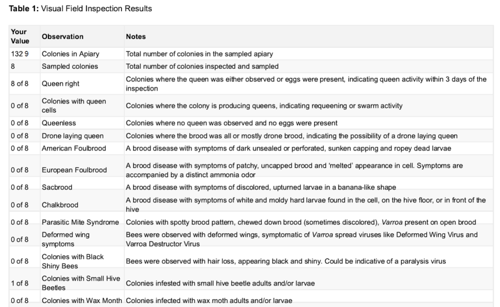
Look to this table to confirm indications of the following:
- Elevated Varroa infestation by reviewing indications of noted Parasitic Mite Syndrome or Deformed Wing Virus
- Queen status: Is your colony queenright? Does it have a laying worker? Were queen cells noted?
- Small hive beetle and wax moth presence: These are secondary pests that may become ensconced in a weak colony. This may be due to low populations caused by queenlessness, high mite levels, or diseased populations
- Paralysis viruses indicated by the presence of black, shiny bees
- Visual signs of European or American Foul Brood (EFB or AFB)
- Brood diseases such as Chalkbrood or Sacbrood
Lab Diagnostics [Table 2, Figures 1 and 2]:
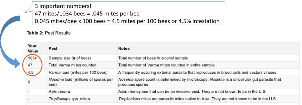
The table details the results of the composite (yard level) alcohol sample and the composite brood frame bump sample taken from your 8 colonies. Specifically, it lists the following:
- Total number of bees collected (We weigh your sample to get an accurate count)
- Number of Varroa we recovered in that sample of bees
- Varroa load (calculated by taking the number of Varroa divided by the number of bees and multiplied by 100)
- Nosema spore load calculated from a subsample under a microscope
- Presence or absence of Apis cerana (all bees checked visually)
- Presence or absence of the Tropilaelaps mite (examined microscopically using a filtered sample from your brood frames).
The beekeeper in the example given below has a Varroa load of 4.5 mites per 100 bees or a 4.5% infestation.
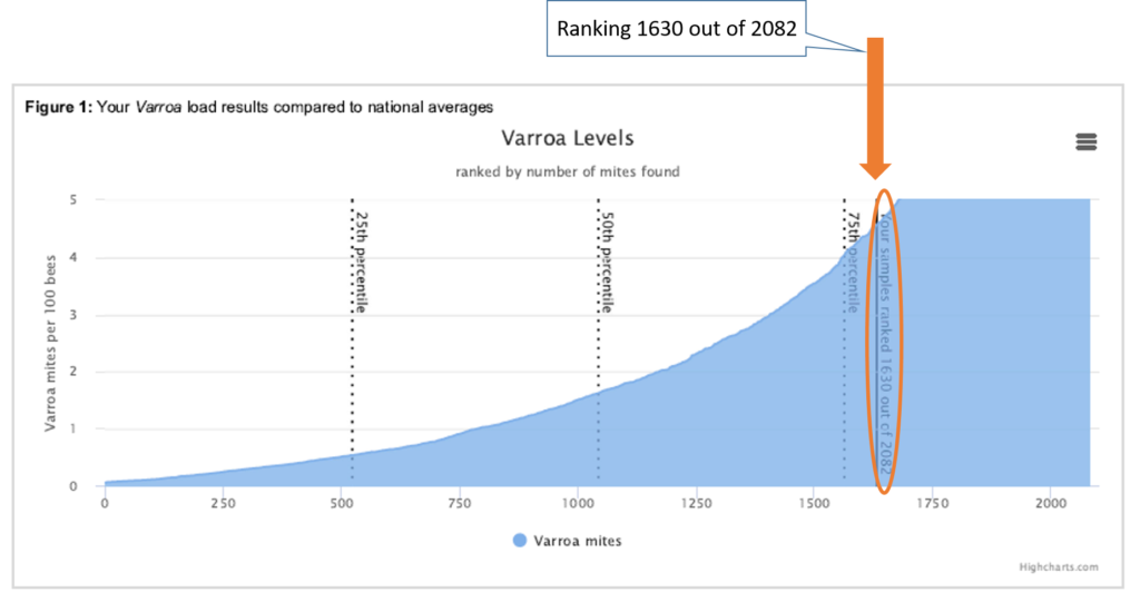
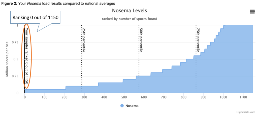
In Figure 1, we’ve provided an illustration of a beekeeper’s Varroa values, and in Figure 2, Nosema values. These charts are called quantile or percentile graphs. They illustrate your sample compared to the cumulative ranking of Varroa loads (Figure 1) for all samples processed the prior year.
In the example shown below, this participant’s Varroa load was above the 75th percentile for this year. Their ranking, 1630 out of the year-to-date total of 2082 samples, meant that their Varroa load was higher than 75% of the samples taken in the last calendar year. In this case, unlike an IQ score, a higher value is not better. Again, please remember context! Because we receive samples just about every month of the year, your Varroa load may be higher, as you would expect, in the summer and fall months, or before a treatment, than other beekeepers. Conversely, if your samples were taken early in the year or after a treatment, your Varroa load may be less than the cumulative load for those reasons. Figure 2, the Nosema chart, when added, can be viewed in the same way.
Molecular Pathogen Diagnostics [Table 3, Figures 3 and 4]:
Here, all of the pathogen targets we screen for using molecular analysis are listed. These include multiple known viruses, as well as genetic markers for Nosema ceranae. From a previous blog, you know that we not only look for the dormant Nosema spores (via microscopy), but also for the vegetative state via qPCR (genetic screening). It is therefore possible to have what appears to be conflicting results between the molecular and microscopic report, because we use two different screening methods, and we detect different phases of the infection.
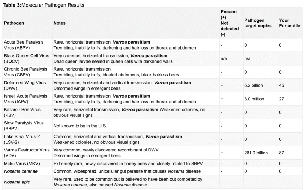
This table details the pathogen in column 1, provides notes on that specific pathogen in column 2, and then lists a plus (pathogen detected) or minus (pathogen not detected) in column 3. You could stop reading there if you want. That third column tells you immediately whether your bees were infected or not; however, if you want to see how much they were infected and where your sample fell within the national pool, the last 2 columns (4 and 5) provide more detailed information. Column 4 represents how many copies of the virus were detected in your sample. If you have heard us drone on about “qPCR” in our viral processing, the “q” in that acronym stands for “quantative,” meaning that we are not only detecting the presence of a pathogen, but we are also quantifying how much of it is in the sample. Higher viral loads (# of copies of the virus) can sometimes be associated with increased disease and mortality. The larger that number is, the more highly they were infected. Finally, column 5 ranks your level of infection with the national aggregate. Just like in the Varroa and Nosema graphs, a higher value is not better. For instance, if your percentile for Varroa Destructor Virus is 87, that means that your viral copies were higher than 87% of all of the samples throughout the history of the survey. What does that mean? If any of the viruses you tested high for are related to Varroa parasitism, it may be that you had high levels of Varroa recently. Although it is often said that no treatments exist for many of the honey bee viruses, at least 7 are related to Varroa. Monitoring and having a Varroa management plan in place are vitally important for keeping your bees healthy.
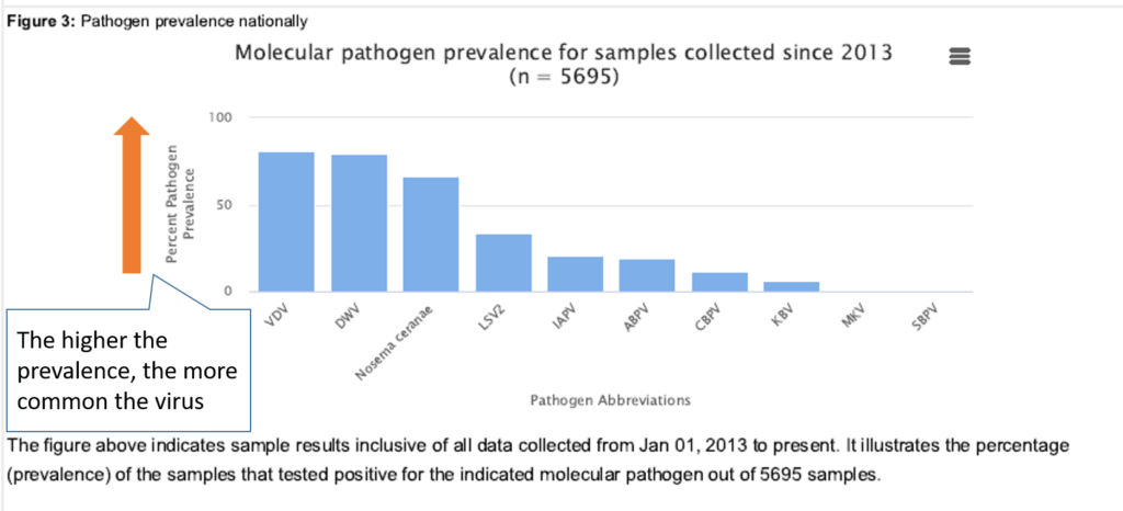
Because we look for so many viruses, and some are rarer than others, we’ve provided a bar chart (Figure 3) to illustrate the proportion of samples that have tested positive for the virus since 2013. Here you can see that Varroa Destructor Virus (VDV) and Deformed Wing Virus (DWV) are very common. More than 80% of our samples test positive for them. Much less common are the viruses on the right side of that graph.
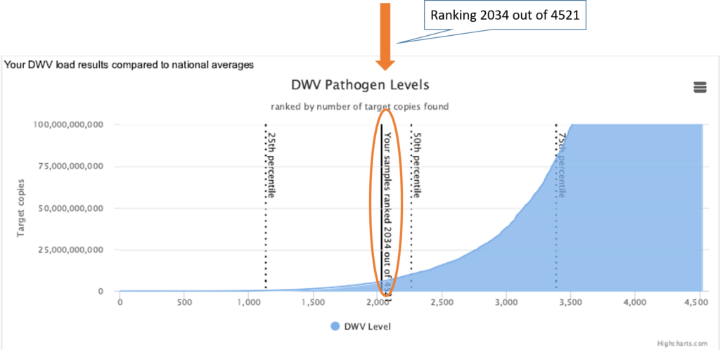
For your own personal viral loads, we’ve given you the same type of quantile graph (Figure 4) as we did for Varroa and Nosema. Below, you can see an example of one beekeeper who had a positive test for DWV and whose sample produced 6.2 billion viral copies, putting them in the 45th percentile. This means that they had viral loads higher than 45% of the historical national aggregate. The quantile graph illustrates your sample compared to the cumulative ranking of this specific virus for all samples taken since 2013. Again, it is important to remember when your sample was taken and if the viruses are related to Varroa.
Pesticides [Table 4, Figures 5 and 6]:
If you are one of the participants who had a pesticide sample taken, Table 4 lists the specific pesticides detected in your sample (and whether it was a wax or bee bread sample) and the level (in parts per billion – ppb) at which they were detected. For comparison, we provide the national prevalence, the lethal dose that would kill 50% of adult bees when exposed in an acute test in laboratory condition in usually 48 hours (called LD50) that we found in the literature, and your Hazard Quotient, which is a ratio of the residue level found in your sample and the LD50. The Hazard Quotient provides context by allowing us to compare residue levels between more and less toxicological substances: a little of a dangerous substance might get a same HQ as a lot of a less dangerous one. It is also one way of modeling cumulative risk presented by multiple pesticides.
In the example below, 4 pesticides were found in the wax sample, with only two of them at trace amounts. “2, 4 DMPF” is a metabolite of Amitraz, a common Varroa mite treatment ingredient, and the metabolite is found in more than 70% of all wax samples. “Thymol,” another active ingredient in Varroa mite treatments, was found, and it is detected in 79% of all wax samples. With “only” 4 detections, this sample is relatively low in pesticide detections, which is rare in wax samples (we see an average of 14 pesticide detections for wax and 2.8 detections of pesticides per sample for bee bread). Since wax is lipophilic, as mentioned in our blog here, and most pesticides are also lipophilic, pesticides tend to linger longer in wax. We detect far more pesticides in wax than we do in bee bread for that very reason. So again, context! Samples taken from bee bread will typically have far fewer pesticide detections than wax. Here, two other pesticides were detected, “Diuron” and” Carbendazim.” As a beekeeper, we highly recommend that you investigate what pesticides are listed on your report. In this case, Diuron is an herbicide used to control grassy weeds and algae. Carbendazim is a fungicide used to control plant diseases on fruits such as bananas, strawberries, and citrus and is also used to control worm castings on golf courses. Having an idea of where your bees fly and how they interact in the environment to pick up such diverse pesticides gives you, the beekeeper, additional data that may inform your management.

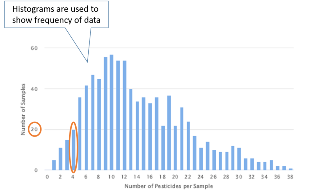
In your report, Figure 5 is a histogram of all samples taken nationally for wax. A histogram is a chart used to display frequency of information and is a visual representation of the distribution of the data. In this case, it displays the number of times that samples test positive for 0 pesticides, 1 pesticide, 2 pesticides, all the way up to 38 pesticides. In this example, our report tested positive for 4 pesticides. On the histogram, we can see that a total of 20 samples tested positive for 4 pesticides. This provides the beekeeper with meaningful information (context!) as they can see that most samples had more than 4 pesticides detected.
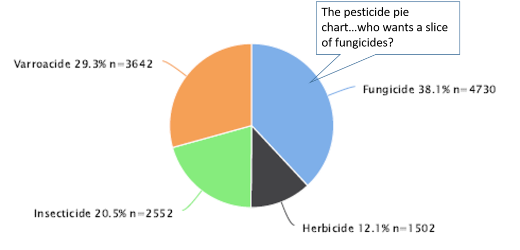
Finally (we’re almost there), the last graph (Figure 7) is a pie chart, famously known (and often over-used) to display numerical proportion. In this case, it is a graphical representation of the proportion of pesticides detected nationally. Pesticides can be broken down into 3 main groups: fungicides, insecticides, and herbicides. Since beekeepers are a special case (aren’t we though?!), we also have indicated varroacides, pesticides that we insert into colonies to control for Varroa mites. Here, you can see that fungicides are detected most often, closely followed by varroacides. Often, a pesticide can be used across categories, and we count those in each category where they apply. The “n” value provides the reader with the sample size in that category. For example, “n=3,642” indicates that the particular slice of the pesticide pie was formed by 3,642 data points. A higher “n” value engenders more trust in the data and to any conclusions that may be drawn. You want your sample size, just like your blueberry pie, to be as large as possible.
Our lab does our best to provide you with accurate diagnostic data, but we’ve also taken it one step further by equipping you with background and situational information (context!) to not only better inform you on the health of your bees, but also to illustrate how they look in the larger data landscape. We will continue to change and improve your reports, and we hope that you will now look at your report with a fresh set of critical and informed eyes.
